My main email client on all computer platforms is Thunderbird. I used to only make use of the web site related to my various emails, but having the email available offline is a must for me. At work I am forced to use Outlook, which I actually think is also great. But at home, I want to have a cross-platform client and I do enjoy Thunderbird being open source/free software.
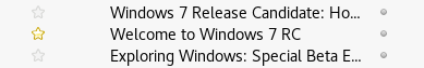
But one of my biggest gripe with almost all email clients is that it isn’t obvious to me which items are flagged/starred or not. Either it is not a big enough marker, or the marker simply doesn’t have enough contrast. An example of the latter is a yellow star against the white background of the item, which is the case for the default theme in Thunderbird. Yellow against white are pretty much indistinguishable to me as a color blind person.
Outlook wasn’t any better though, with a simple flag icon, even though I thought it was actually somewhat useable. But a few months ago after an update, they changed the style such that the background of the item was also changed to an orange color. Not really sure about the actual color, due to the color blindness, but the important part is that it improved the UX for me immensely.
Thinking that there has to be a solution for me somewhere for Thunderbird, I first started looking at other themes. But after looking around, I simply didn’t find anything I liked. Beside this one issue, the default theme works great for me. After some very intense searching late in the night, I finally found this was possible by editing the userChrome.css file. But what is possible to do in this file is not that easy to figure out, at least if you want to do something as specific as the background color of flagged items. But not that surprisingly, I am not the only one thinking that flagged items should be made more distinct. In the comments for this issue, there were gladfully some examples of how to do this!
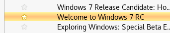
Thinking that the styling in Outlook met my needs, I used it as inspiration. I settled with this:
treechildren::-moz-tree-cell(flagged) {
    background-image: linear-gradient(to bottom, #fff394, #ffc27d, #fff394);
}
This gives Thunderbird the following look:
Which I think is A LOT better than the default look: